Oil is priced in U.S. Dollar (USD or US$); therefore, the oil price becomes strongly linked to fluctuations to the strengths and weaknesses of the USD. The USD is the world’s dominant reserves currency, and changes to its exchange rate are closely linked to the monetary policies of the U.S. Federal Reserve (the Fed in short), and the U.S. fiscal policies.
The Fed has a monopoly for controlling the volume of USD (Federal Reserves Notes, FRN) in global circulation.
In reading this article it is imperative to understand the differences between monetary policies, and the monetary system.
The oil (or energy) system is one or several subsystems embedded in the global financial matrix, and monetary and fiscal policies thus influence the oil’s price formation.
The sequence and interdependence of these activities are.
Changes to total credit/debt ==> Changes to energy consumption ==> Changes to GDP
For all practical purposes, this article documents that these activities in recent decades were perfectly correlated.
- World GDP (PPP) and world energy consumption have been 99% correlated during the last 4 decades, refer also figure 04.
- World economic activity is commonly expressed as changes to Gross Domestic Product (GDP expressed in USD PPP), and in recent decades this has been 98% correlated with changes in world total credit/debt (expressed in USD market value), ref also figure 06.
In short, this means that economic growth (growth in GDP) for several decades has and still is dependent on borrowing from the future (continue growth by taking on more credit/debt) and pull demand forward in time.
As countries, corporations, and households approach debt saturation, growth in credit/debt will slow, which will weaken the so-called credit impulse and economic growth.
Debt saturation; maxed-out balance sheets cannot accommodate more credit/debt. The entity cannot service more credit/debt as additional credit/debt offers diminishing returns with little or no stimulative effect on the economy.
Lowering interest rates allowed for growth in total credit/debt, and gradually a more significant portion of the income becomes allocated to service the growing debts unless income grows as fast or faster.
The numerator is the second derivative of YoY changes to total private and public debt, while the denominator is the GDP.
The rationale for including YoY changes in public deficits/surpluses is that they add or subtract aggregate demand.
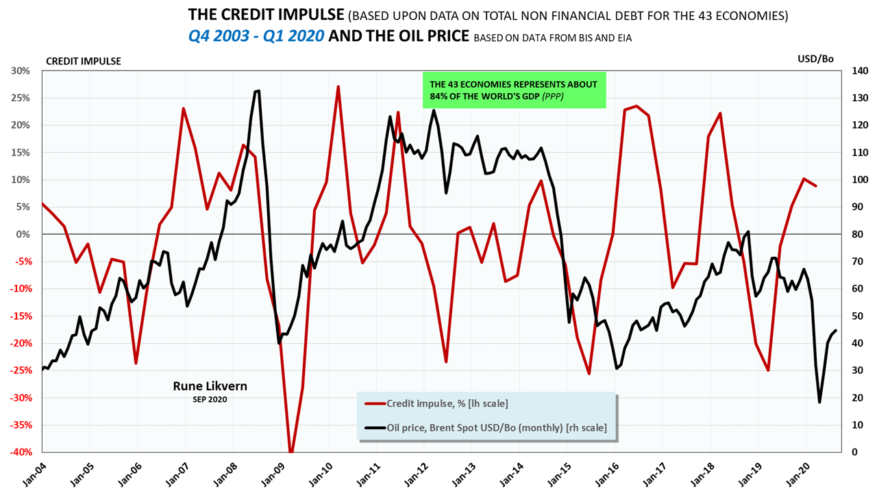
Figure 1 illustrates the close associations between movements in the oil price with changes in the credit impulse.
I would argue to include public deficits/surpluses when calculating the credit impulse. Public deficit spending adds to aggregate demand.
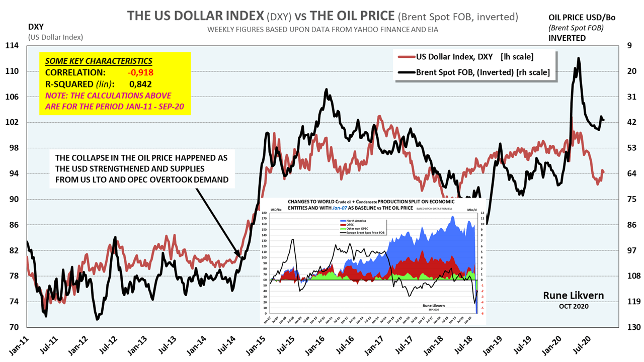
The high in the oil price during the summer of 2008 happened while the USD was weak.
Towards the end of QE3 in 2014, the USD started to strengthen versus most other currencies (refer also figures 13, 15, and 17).
One significant contributor to the spike in the oil price in 2008 was that investors would rather hold something tangible instead of the rapidly weakening USD, refer also figure 02.
Investors wanting out of their oil positions may partly explain the unprecedented collapse in the oil price of more than USD 100/Bo over a few months in the second half of 2008.
The high investments in U.S. Light Tight Oil (LTO) extraction continued after the collapse in the oil price in 2014 based on expectations of a sustained higher oil price. The effects of a weaker USD and high global credit/debt growth appears poorly recognized.
In 2016 a new round with high global credit/debt growth helped support a renewed increase in the oil price. This credit impulse came to an end during Q1-2018, and the oil price collapsed again in Q3-2018. The USD appreciated (higher DXY) significantly since the end of 2014.

The correlation calculations between the oil price and the DXY for Jan-00 to Sep-20 came out at 0,78.
Oil (and several other commodities) priced in USD has an inverse correlation with the USD index (DXY), and the strength of this correlation is not stable.
In figure 02, and for what it is worth, note that the oil price did not move above USD 100/Bo when the DXY was above 90.
Figure 13 shows that the oil price was high and inversely correlated with (DXY) from Jan-11 to Sep-20 (this is somewhat deceptive and will be documented below in this article).
Many other factors influence the oil price, like supply/demand balances, the ebb and flow of speculative momentums, perceptions of future economic developments, changes to consumers’ affordability, and stock levels.
This article will focus on the associations between the oil price, oil supplies (crude oil and condensates; C+C), and the DXY.
The rapidly growing DXY leading up to the oil price collapse in 2014 was a more dominant factor in the collapse of the oil price than the strong growth in U.S. Light Tight Oil (LTO) extraction followed by the increased supplies from OPEC, refer also figures 13, 15 and 16.
In recent decades there has been an exponential growth in world aggregate credit/debt (see also figure 05), which fueled economic growth that commanded an increase in oil/energy consumption (this includes the rapid growth in so-called renewables like solar and wind).
The growth in global credit/debt and a weaker USD combined with low-interest rates in the U.S. allowed for periods with higher USD denominated oil prices partly funded by an increase in external US Dollar-denominated debt now estimated at around USD 13 Trillion.
The increased borrowing from the future allowed for many improvements in living standards and higher wealth accumulation.
- This article documents a perfect correlation between changes to the world GDP (PPP) with changes to world energy consumption.
- GDP is perfectly correlated with changes to total non-financial credit/debt.
- Ergo world energy consumption and GDP have, for decades, been perfectly correlated with changes to total non-financial credit/debt. The above is based on several analyses of the correlation of credit/debt and GDP for 43 of the economies reporting developments in credit/debt to the Bank for International Settlements (BIS). GDP numbers from the International Monetary Fund (IMF) refer also figure 06.
These 43 economies represented about 84% of the world’s GDP (PPP) for 2000 to 2019.
- As for everything else, the axiom “Demand is what one can pay for.” applies to oil.
- The 43 economies took an average of USD 1,80 in non-financial credit/debt to create USD 1 in GDP from 2001 to 2019. In other words, credit/debt grew at a much faster pace than GDP, which will go on until it cannot.
- Now and from the alignments of several factors, it is hard to find support for a higher oil price in 2020 than in 2019.
- The credit impulse for the economies representing 84% of the world’s GDP (refer also figure 10) turned positive during Q3-19 and reversed in Q1-20 and likely weakened since Covid-19.
The credit impulse could go negative during Q2-20 and likely remain close to neutral during the second half of 2020.
The major central banks and governments’ concerted efforts to offset any slowdowns from the Covid-19 will likely become a sugar high for the stock markets. It is difficult to see how these central bank interventions and fiscal stimulus packages would become a positive for companies’ earnings or how they could paper over all the effects from any supply and demand disruptions caused by Covid-19.
The concerted efforts from the world’s central banks and the fiscal stimulus packages offset some effects from debt deflation and see that growth as soon as possible returns to its pre-Covid-19 trajectory.
- OPEC+ had curtailed about 1,7 Mbo/d of supplies, then add another 0,8 Mbo/d from Libya due to recent flare in social strife and some 1+ Mbo/d from Iran sanctions.
This totaled 3,5 – 4,0 Mbo/d curtailed supplies within OPEC+ for various reasons that could be brought in on short notice if demand and political mitigations allowed.
Kuwait and Saudi Arabia have reached an agreement for the Neutral Zone that could add about 0,5 Mbo/d in supplies by the end of 2020.
Venezuela is another OPEC member that has the potential to increase supplies. However, many observers think it will take many years before present oil supplies at around 0,4 – 0,5 Mbo/d from Venezuela could reach 2,5 Mbo/d or more.
If the data above are close and pre-Covid-19, there was a global supply overhang for oil that could take some time to work through.
- Since Oct-18, OECD petroleum consumption declined at an annualized rate of about 1% (or 0,5 Mb/d) per Feb-20 (before Covid-19 and refer also figure 18).
- Global supplies of crude oil and condensates (C+C) was 0,6 Mbo/d lower in 2019 than in 2018.
(Based on data from EIA).
The lower supplies reflect a slowdown in world economic activity, reducing oil demand.
- In 2019 OECD petroleum stocks were on a small upward trend (seasonally adjusted) while OECD petroleum production grew (refer also figure 19), and OECD petroleum consumption was moderately down.
- From monitoring the oil market for more than a decade, I have increasingly become convinced that from now on, consumer affordability will grow in importance as the factor that establishes an upper sustainable ceiling for the oil price.
Above some threshold for the oil price, consumers will reduce their consumption, thus adjusting their demand to what they can afford.
The upper sustainable, affordable ceiling for the oil price (Brent spot) has, in recent years, appeared to be about USD 70/Bo. Refer also figure 17.
This ceiling could shortly become lowered due to a combination of factors like an appreciating USD, reduced consumer affordability, slower global credit growth, or debt deflation, late effects from the ongoing efforts to contain Covid-19. All these reduce the world’s economic growth, energy consumption, and GDP.
- Historically the interest on U.S. 10 Year Treasury initially came up due to inflation expectations, and the USD appreciated when the Fed started their Quantitative Easing (QE) programs. Expectations are this may happen again as the Fed continues its (official) QE programs. An appreciating USD will be bearish for the oil price.
- In some of his tweets, President Trump has called for USD intervention, which means a USD’s devaluation. The rationale for this may be to avoid a repeat of the Plaza Accord from 1985. The U.S. has a significant trade deficit, and a weaker USD would lower imports and stimulate sales of U.S.-made products, thus narrowing its trade deficit.
- Devaluing the USD is a challenging game to play in an election year as a weaker USD makes imports more expensive and bears the prospect of a higher nominal oil price. Already stretched out consumers would experience lowered affordability from a depreciated (devalued) USD and could come to show this at the ballot boxes during the presidential election of 2020.
- The USD’s exchange rate is apparently one crucial factor, but the USD does not operate in a vacuum, and it is very much about the flow of credit. An appreciating USD may offset credit growth outside the U.S. and make other countries credit stock shrink expressed at USD market value. A positive flow in some local currencies becomes negative when shown in USD market value, as happened as the USD strengthened in 2014, refer also figure 08.
- With total global debt levels above USD 250 Trillion (and growing and not accounting for debt in the shadow bank system), an average increase in the interest of 0,1% has a similar effect on the global economy as an increase in the price of crude oil of about USD 8/Bo.
Historically borrowers have given priority to servicing their debts and forfeited consumption when faced with higher interest rates.
The point here is that the oil price is in serious competition with how maxed out consumers allocate their stagnant real incomes between debt service costs, growth in health insurance, growing food prices, higher rents, and more.- Studies (pre-Covid-19) found that more than 40% of U.S. households could not come up with $1 000 should an emergency arise (hospital stay, car break down, etc.).
An average U.S. household of 4 uses annually 70 barrels of crude oil (directly and indirectly). A sustained higher oil price of $15/Bo would in a year wipe out whatever economic slack more than 40% of U.S. households have.
The above may illustrate a threshold for how much higher oil prices a significant portion of the U.S. consumers can sustain before affecting their consumption.
A high oil price that starts to hurt consumers becomes a political issue rapidly.
- Studies (pre-Covid-19) found that more than 40% of U.S. households could not come up with $1 000 should an emergency arise (hospital stay, car break down, etc.).
- Several studies have shown that new oil supplies, whether offshore or LTO require an oil price above USD 70/Bo (Brent) to become profitable. USD 70/Bo (or likely lower) appears now to be the level for what consumers now can absorb and maintain present consumption levels.
I expect the consumers’ affordability threshold with time will move lower, which will be at odds with what the oil companies need to bring new profitable supplies to the market.
This affordability issue could last a long time as the world burns through its developed and producing “cheap” oil reserves. The consumers will likely respond to price increases by persistently reducing consumption and adjust their behavior to prolong their struggle against increases in the oil price. Growth in the oil price will originate from declining supplies of “cheap” oil until it inevitably develops into a price that no longer can sustain their previous consumption habits. - All bets are off for predictions of the oil price if a significant geopolitical event (like Covid-19) that constrains a big portion of global demand or supplies of oil for some lengthy period.
Changes to credit/debt, energy consumption, and GDP
It is imperative to quantify the strength of the relations between energy consumption, Gross Domestic Product (GDP, PPP), and total non-financial credit/debt resulting from fiscal and monetary policies.
Below follows the results from quantifying the strengths of these relations.

The black line [lh scale] shows development in world GDP (USD PPP) between 1980 and 2019.
One noticeable takeaway from figure 03 is that the exponential growth in renewables (primarily solar and wind) appears to have been additive. The contribution from renewables is a source for much-heated debate to what extent renewables have substituted for fossil fuels. The reason for that is that the year over year growth in fossil fuel consumption in absolute terms has grown more than the renewables. In this century, the exception so far was 2009 following the Global Financial Crisis (GFC).
The data for world energy consumption versus GDP (PPP) from 1980 to 2019 has been organized in the scatter plot shown in figure 04.
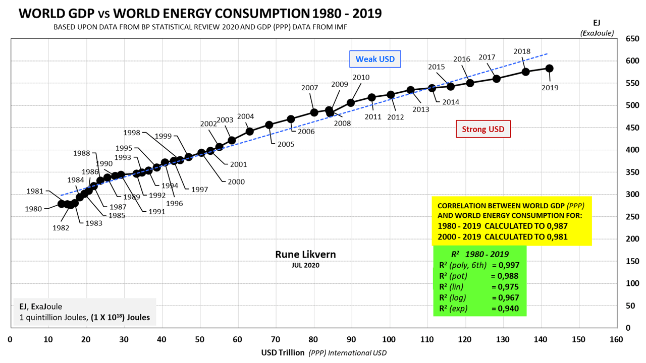
The blue dotted trend line describes the R squared by a linear function (denoted (lin)) in the table.
The correlation tells something about the strength of the relationship (association) between GDP and energy consumption.
R squared (R2) defines the extent to which one variable’s variance explains the second variation.
Correlations and R squared around 99% show how strong the association between world GDP and world energy consumption was from 1980 to 2019.
GDP is by many referred to as income.
The reference of GDP as income is a misnomer as GDP is the aggregate of all end transactions within an economy in some specified year. A more precise description would be to describe GDP as some capacity or flow.
All these transactions require some energy input to become realized. Currency (commonly referred to as money) settle these (financial) transactions; thus, currency (including use of and accumulation of credit/debt) becomes claims on future energy use (allocation).
A parable used to distinguish currency (as a representative of the financial system) and energy is to liken it to a Personal Computer (PC) where the Operating System (OS) acts like the financial system allocating resources from demand and where the power supply accomplishes the PC’s need for resource allocations.
Growth in world credit/debt has allowed pulling demand (and thus energy consumption) forward in time against a promise of repaying these debts with interest in the future. Retirement of the world’s growing total financial credit/debt acts as covenants to allocate some of the future energy consumption.
Note in figure 04 how energy consumption moves above or below the trendline (dotted blue line) as the USD is weak or strong.
If for some reason, the future brings higher interest rates and or significantly higher energy prices, the successful retirement or rollover of many of the accumulated debts would face severe headwinds.
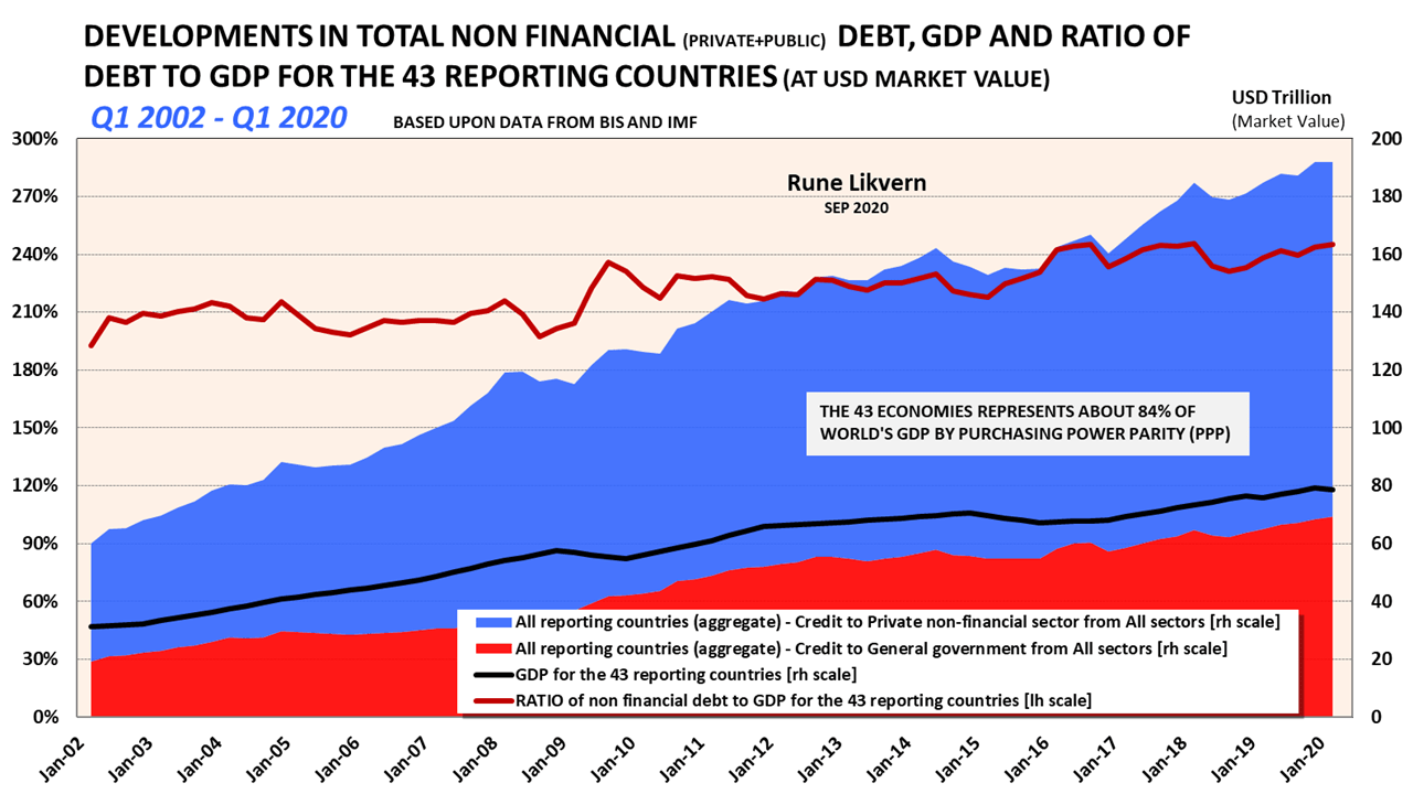
The black line [rh scale] shows the total GDP developments for these 43 economies at USD Market Value.
These countries constituted about 84% of the world GDP (PPP) based on the International Monetary Fund (IMF) data.
The red line [lh scale] shows the developments in the ratio of total non-financial debt to GDP at USD Market Value for the 43 economies.
The chart shows how total non-financial credit/debt has grown faster than GDP.
Figure 06 shows the non-financial credit/debt plotted versus GDP (PPP) for these 43 economies for 2001 to 2019.
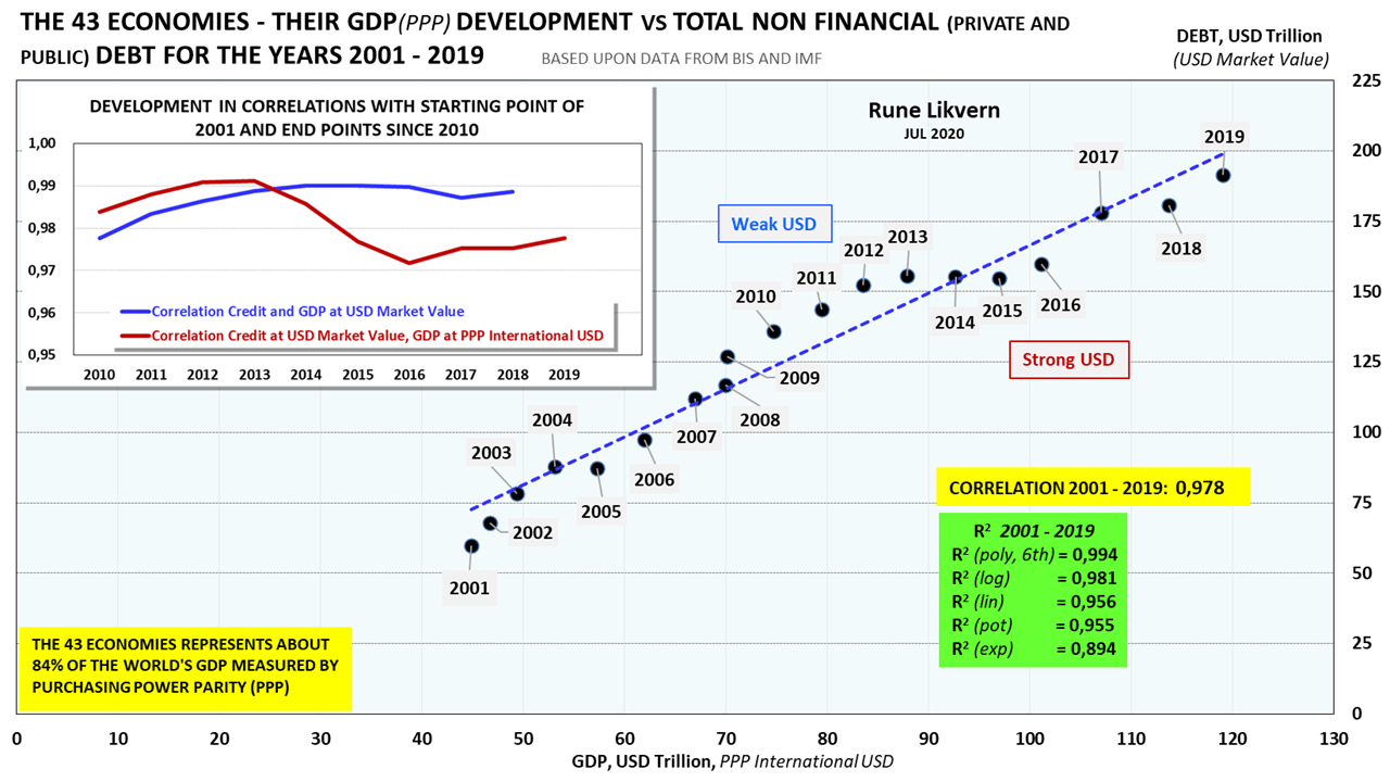
The chart also shows the results from a correlation analysis spanning the years 2001 to 2019.
The R squared at different methods for these variables from 2001 to 2019 is shown in a separate table.
The embedded chart shows the developments in the correlations from 2010 to 2018/2019 using 2001 as a baseline. The blue line is based on credit and GDP at USD market value from 2010 to 2018 – the red line from 2010 to 2019 based on credit at USD market value and GDP at PPP.
The blue dotted line describes R squared’s trend line by a linear function (denoted (lin) in the table).
A correlation of 98% and R squared (lin) at 96% shows the strong association between GDP and non-financial credit/debt for these 43 economies for 2001 to 2019.
In the recent two decades, 98% – 99% of GDP changes have been associated with total non-financial credit/debt changes.
These 43 economies added an average of USD 1,80 in credit/debt to grow their GDP (PPP) with USD 1,00 from 2001 to 2019.
Above was shown that GDP and energy consumption, and GDP and total non-financial credit/debt are all strongly correlated.
GDP and changes to total debt/credit are codependent variables.
Since the world started to grow its total credit/debt some four decades ago, its energy consumption and GDP followed lockstep.
The sequence and interdependence of these activities are.
Changes to total credit/debt ==> Changes to energy consumption ==> Changes to GDP
The above sequence and relations act as an introduction to interpret the guidelines for economic activity changes derived from the credit impulse.

The scatter plot shows that it roughly required the U.S. 10 Year Treasury rate to move below 4% before the oil price moved above USD 100/Bo.
In the first half of the ’80s, the Fed’s monetary policies kept the U.S. 10 Year Treasury rate above 10%. Simultaneously, the oil price moved from about USD 37/Bo in 1980 to about USD 14/Bo in 1986, which begs the question of what influence the lasting higher (U.S.) interest rate had on bringing down the oil price during this period.
The chart also shows that a major geopolitical event like the Gulf war in 1990/91 pushed the oil price higher while the U.S. 10 Year Treasury was at what now would be considered as unsustainable levels.
Now we are in unchartered territory and post the global measures to contain Covid-19; the U.S. 10 Year Treasury has averaged around 0,7% (recently it dropped below 0,6%) while the oil price collapsed due to the steep decline in global demand. The main takeaway from this is that the bond market now has low expectations for future inflation and economic growth. The bond market could force the U.S. 10 Year Treasury into negative territory, reflecting expectations of coming deflation and provide headwinds for growth in the oil price. Globally are considerable oil capacities voluntarily and involuntarily shut down to balance supply and demand to regain price support. In recent weeks, the oil price has bounced back and moved above USD 40/Bo.
How oil producers will respond to this recent rebound in the oil price remains to be seen. The current ailments of low oil prices could motivate many producers to increase their revenues [increasing flow/production is part of that equation] to start healing their ailing balance sheets.
The Credit Impulse
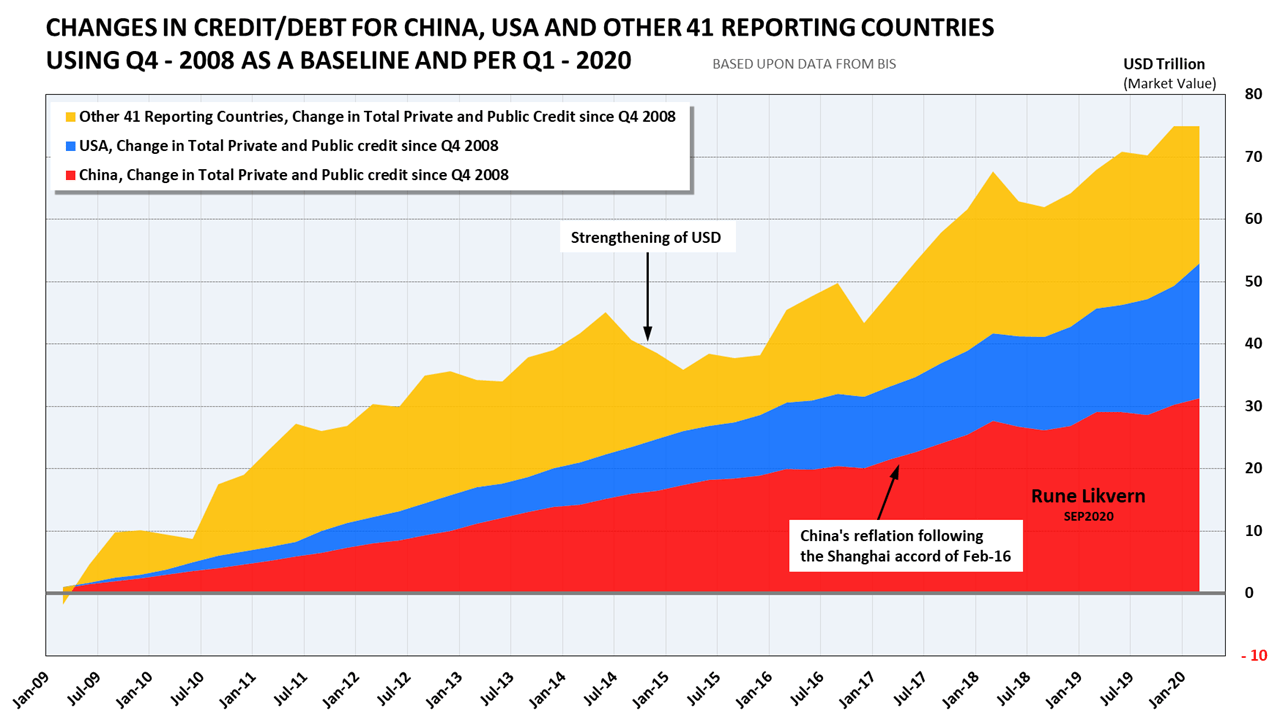
The 43 economies grew their non-financial credit/debt by 64% from Q4 2008 to Q1 2020. More than 40% of this growth in credit/debt came from China.
In the aftermath of the significant appreciating USD (growth in the DXY), the stock of credit/debt for the other 41 countries dropped by more than USD 11 trillion (more than 11%) by market value from Q2 2014 to Q2 2015. A significant contribution to the collapse of the oil price in 2014 came from this deflationary impulse.
Refer also to the credit impulse in figures 01 and 10.
China’s reflation that followed the Shanghai accord of Feb-16 appears to have lifted the other 41 countries and provided renewed price support for the oil price.
The credit impulse is the second derivative of Year over Year (YoY) changes to credit/debt divided by GDP. The credit impulse is expressed as a portion of the GDP. The credit impulse value gives information about the outlook for and strength/weakness of near-term economic development.
A positive and strong credit impulse signals growth or expansion. It could also result from a lower credit contraction (negative growth in credit) than the previous period indicating a slowing in the contraction. A negative credit impulse signals a slowdown, and the more negative, the steeper the deceleration.
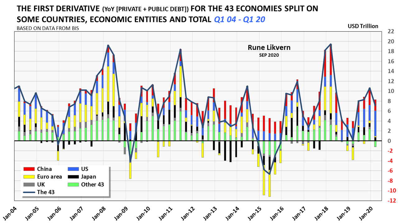
Changes to total global credit growth are good indicators of the near future trajectory for the global economy. Strong credit growth signals healthy economic growth, which also grows the consumption of energy. If there was a tight supply/demand balance for any commodity, more credit could be conjured ex nihilo to absorb the resulting growth in commodity prices. The solution to higher commodity prices is higher prices as a sustained higher price provides a signal to grow capacities.
This works both for the producers and the consumers. However, there is a limit to how much credit both these parties can take on and still service it. In other words, both can expand their balance sheets until the tide turns, and stress at the consumers is likely the trigger that will set off any slowdown.
2015 had a more profound decline in year over year (YoY) credit growth (USD market value) for the 43 because of the USD’s strengthening, which made some fear something like a repeat of the GFC of 2008/2009.
The Shanghai accord and China’s reflation brought the world back on its growth trajectory.

The chart also shows the degree of synchronicity in credit/debt changes in the presented countries.
The credit impulse results from dividing the second derivative of the YoY changes in credit/debt to the GDP of the 43 economies reporting data to BIS, refer also figure 01. Figure 01 shows the strong negative values of the credit impulse for Q2 15 and Q1 19. The negative credit impulse is a leading indicator of an economic slowdown. An economic downturn may become reflected in global oil consumption, and the most recent EIA data on world oil (C + C) supply shows this declined by 0,6 Mbo/d from 2018 to 2019.
From 2018 to 2019, the OECD reduced its petroleum consumption of about 1%, reflecting an economic slowdown, refer also figure 18.

From the end of 2008 to the end of 2019, China grew its non-financial credit/debt by more than USD 30 Trillion (more than 465%) while the other four grew it with about USD 4,1 Trillion (or 92%).
The numbers above illustrate the importance of China’s credit expansion both for China’s and the world’s economic growth after the Global Financial Crisis (GFC) in 2008.
China had an oil consumption of 14,1 Mb/d in 2019, while the other four was 12,0 Mb/d.
Many analysts have pointed to India as the potential new “super grower.”
Concerning India’s growth, a respected analyst succinctly put it, “India is about highways,” meaning that a leading indicator for the pace of future growth in India would be about investments in infrastructure as economic growth also is about capacities for movements of people and goods.
India will be less likely to emerge as a “super grower” because of structural differences between the Indian and Chinese economies like trade balances. India would need more collateral for its credit expansion. This collateral could come from expanding its manufacturing base, which begs to manufacture what for the world market.
It may take 4-5 more years before it becomes clear if India has embarked on a similar credit expansion path as China.

The purpose of the chart is to show the contributions from some selected economies and groups of countries to the second derivative of YoY changes to credit/debt (or credit impulse) for the 43 countries reporting data to BIS.
NOTE 1: The DXY is a weighted geometric mean and heavy weighted towards the Euro, which means that the relations between USD and DXY are nonlinear.
NOTE 2: Scaling of the left- and right-hand y-axis and the right-hand y-axis is INVERTED.
Figure 13 shows that the collapse in the oil price in 2014 started as the DXY began to grow some months after the Fed in late 2013 started to taper its Quantitative Easing 3 (QE3) program that ended in late October 2014. The collapse in the oil price became amplified by supplies overtaking demand driven primarily by the meteoric rise in Light Tight Oil (LTO) extraction in the U.S. The growth in LTO extraction was encouraged by expectations of a sustained higher nominal oil price and the low-interest-rate policies from the world’s major central banks.
- Developments to the DXY and its (inverse) relation to the oil price are worth to follow as a future appreciation of the USD could come by from a combination of workings like:
- Some estimate that about USD 13 Trillion in USD denominated debt is held by governments and corporations outside the U.S. (Some estimates put this number at USD 25 Trillion).
Servicing and rolling over these debts create demand for USD that strengthens it.
- An increase in the interest rate on these debts will have a similar effect as this increases the demand for USD to service these USD denominated debts.
- Some estimate that about USD 13 Trillion in USD denominated debt is held by governments and corporations outside the U.S. (Some estimates put this number at USD 25 Trillion).
Considerations based on the points above have caused several whispers that the DXY could move above 120 and even to 130 over the next year, which would provide considerable headwinds for the USD denominated oil price.
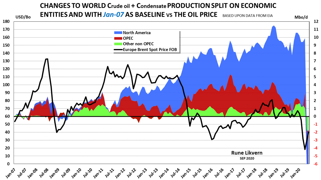
NOTE: For Jun-20, the (C + C) supplies were about 2,9 Mbo/d below the baseline of Jan-07.
Figure 14 was embedded in figure 13 and included to show that there have been periods with big swings in the world (C+C) supplies but seldom did such a small change result in such a hefty price swing as in 2014 when the world (C+C) supplies grew about 2,5 Mbo/d.
The decline in the world (C+C) supplies from Nov-18 to Sep-19 was about 4 Mbo/d without causing a dramatic swing in the oil price. The drop in supplies likely reflects a decline in demand from a global economy that was slowing down. The credit impulse (refer also figure 01) signaled a slowdown in world economic activity from late 2018 lasting into mid or late 2019.
Actual data demonstrates, and presented here, that the oil price for the recent years shows strong general relationships between the USD index (DXY) and supplies. Further and to understand periods of oil prices above USD 100/Bo, it becomes imperative to include how the lowered interest rates allowed for the rapid growth in world total credit/debt, which accommodated an increase in consumption and affordability for a higher oil price.
It may be tempting to use a reductionist approach to use a limited set of data to describe oil price developments through relationships like supplies/demand and the DXY.
Actual data from the recent decade shows a different story. Understandably, governmental institutions, oil companies, and analysts wish for predictability in forecasts (several, and even 30 years into the future) for the oil price.
In the future, another factor will become more present in predicting the future trajectory of the oil price, namely consumers’ affordability.
Predicting the future price trajectory for the oil price will become an increasingly tricky undertaking as more parameters need to enter the equation. The relative importance of individual factors will become subject to continuous changes. One may as well now prepare to embrace more uncertainty in predictions of the future oil price.
Any decline in supplies and the resulting growth in prices will slowly move the affordability threshold higher to balance the market. The price will bring balance to supplies and demand. Any increase in prices resulting from lower supplies will gradually make those at the bottom of the food chain experience this as reduced access to oil (actually oil’s derivatives as various petroleum products), which may diminish their quality of life. At some threshold, it results in protests and maybe worse.
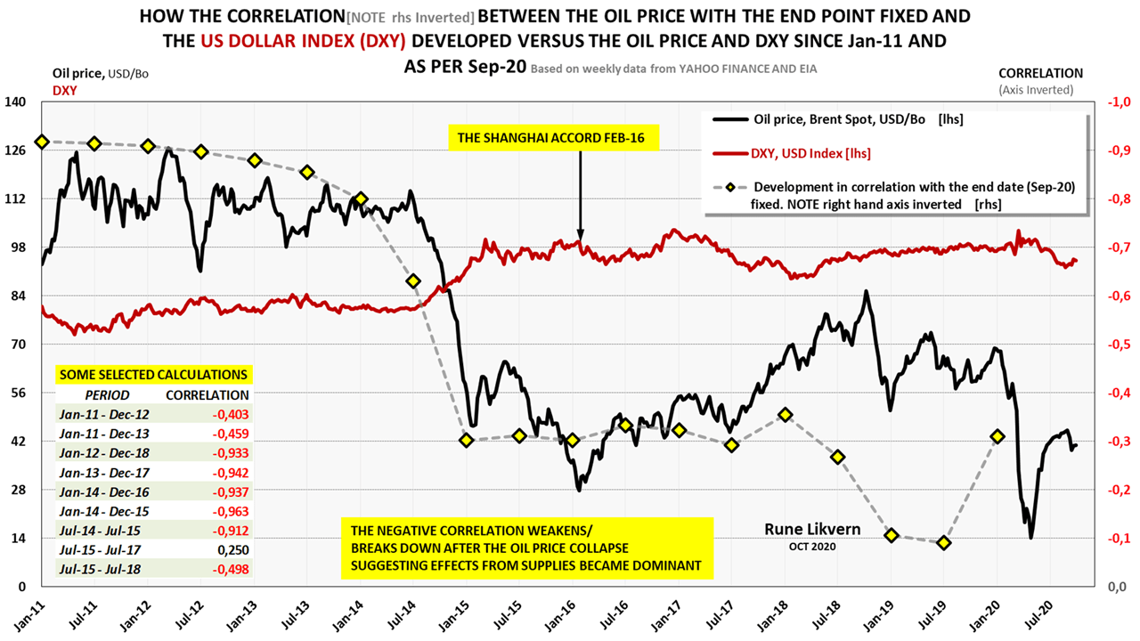
The chart covers the period from Jan-11 to Sep-20.
This exercise shows that the correlation between the oil price and the DXY depends on what period is subject to the analysis, refer also figure 13.
Figure 15 shows the correlation between the oil price and DXY is unstable. Considerations should be given to trends over time, like ten years.
The chart shows that the relationship was robust from Jan-11 to Sep-20, but as the analysis moved to after the price collapse in 2014, the negative correlations broke down. The embedded table illustrates that depending on what period was subject to investigation, the results were all over the place, and very strong around the oil price collapse of 2014.
The collapse of the oil price caused the discontinuity that broke down the correlations from several influential factors like the appreciating USD (higher DXY) and the rapid increase in world (C+C) supplies.
In Figure 16 and refer below to table 1, the analysis focused on a narrower period to let pure statistics (that should hopefully be an objective judge) identify the dominant forces for the oil price collapse in 2014.
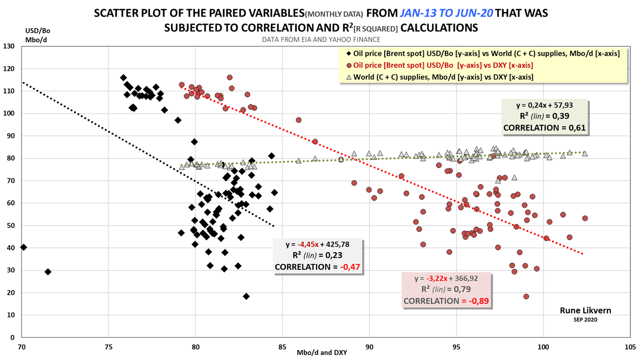
The first set represented by the black diamonds is the oil price [y-axis] plotted versus the world (C+C) supplies [x-axis].
The second set represented by the red dots is the oil price [y-axis] plotted versus the DXY [x-axis].
The third set represented by the green triangles is the world (C+C) [y-axis] supplies versus the DXY [x-axis].
NOTE scaling of x-axis
Figure 16 shows two distinct clusters of data sets (for each of the three pairs) revealing a discontinuity. This discontinuity is the oil price collapse of 2014.
Ideally, the statistical analysis should have allowed for relative weighting of each parameter/variable’s importance and allowed to expand it to changes to petroleum stocks, the credit impulse, and several other parameters.
Hopefully, by pairing several parameters, it becomes possible to quantify the relative importance of the individual elements for the statistical analysis period.
- The strong negative correlation of –0,89 between the DXY and the oil price shows that the DXY was the dominant factor in the price formation (i.e., lowering) of the oil price during its collapse in 2014.
- The positive correlation of 0,61 between world (C+C) supplies and the DXY may have several causes:
- A stronger USD (higher DXY) affects demand from consumers, also refer to figure 17.
- A stronger USD (higher DXY) that lowers the oil price stimulates more supplies from the U.S. and other big producers and net oil exporters like Norway, OPEC, and Russia, to name a few, whose developments and operational costs are mostly in local currencies.
A stronger USD (higher DXY) that lowers the nominal oil price may encourage oil producers to increase their supplies to offset some of the declines in their USD denominated revenues caused by the stronger USD.
Several big oil producers also have USD denominated debt, which needs to be serviced by USD.
At the other end of the equation is the demand that typically becomes stimulated from a lower oil price.
- The pairs with the lowest correlation of -0,47 (recently influenced by the demand collapse from Covid-19, and this analysis presents relative strengths) was the association between the oil price and (C+C) supplies.
A summary from figure 16 is; the strengthening of the USD as the Fed tapered their QE3 program (this may have been one of several unintended consequences) appears to be the major contributor to the oil price collapse in 2014. The analysis shows (in general) that temporarily, the stronger USD was positive for world oil supplies.
Several countries have, over time, experienced a higher oil price in local currencies as these depreciated faster (relative to the USD) than the decline in the oil price.
The correlations to the DXY was shown above.
The U.S. Federal Reserve (The Fed) uses a broader measure, Trade Weighted U.S. Dollar Index Goods and Services (TWEXBGSMTH).
For the period presented (Jan-13 – Jun-20), the correlation between The Fed’s Index and the DXY was 0,938.
Applying the Fed’s broader trade-weighted index showed higher correlations to the oil price (more negative) and the oil supplies (more positive).
In other words, the relative strengths of the correlations between the variables presented here would not have changed much by applying the Fed’s index. The Fed’s index showed stronger associations between the USD’s strength/weakness versus the oil price and the world (C+C) supplies.
Table 1 presents correlation and R-squared calculations for some selected periods that gradually were centered on the period Jan-14 to Jan-15 when the oil price collapsed from USD 112/Bo in Jun-14 to about USD 48/Bo in Jan-15.

Before (Jan-13 – Mar-14), the oil price collapse in 2014, both the correlations and R-squared was weak for all the paired variables.
The same applies to post the oil price collapse in 2014 (Jul-15 – Jul-17).
For the selected three periods during the oil price collapse, the calculations centered on Jan-14 – Jan-15 and then moved in steps of three months to both sides of the central period.
The calculations showed the correlation and R-Squared between (C+C) supplies, and the oil price weakened as the period around the collapse was narrowed. These are still strong relations.
The R-squared tells something about how much the variance of one variable explains the variance of the second. The closer this is to 1,0, the stronger the shared variation is between the two variables.
The strongest (negative) correlation and highest R-squared occurred when the oil price and the DXY period were narrowed around the oil price collapse (Jan-14 to Jan-15 in the table above).
A noticeable outcome from this analysis was the decisive (positive) correlation and high R-squared for the (C+C) supplies and the DXY. These were a bit stronger than for the oil price and the (C+C) supplies.
The conclusions from these statistical analyses are that the appreciating USD (growing DXY, as the FED tapered their QE3 program) played a somewhat more prominent role in the oil price collapse in 2014 than the growth in supplies. The increase in supplies caused by the strengthening of USD (higher DXY) weakened the (nominal USD denominated) oil price, which motivated oil suppliers to increase their supplies to offset some of the declines in USD denominated revenues resulting from a lower USD denominated oil price.
The increase in global (C+C) supplies led by the strong growth in US LTO extraction helped turbocharge the oil price collapse in 2014.
What is an Affordable Oil Price?
That depends on where in the world you live, your income, and wealth.
For decades, the world’s debt-driven growth model has allowed to pull demand forward in time and mitigate periods of higher oil prices (+ 100 USD/Bo). The debt-driven model will become increasingly difficult to sustain.
The weakening of the Yuan in 2018 (refer also figure 11) prompted USA’s president Trump to accuse China of being an exchange rate manipulator.
Benefits from a weakened Yuan makes Chinese exports cheaper and harder for its competitors.
An appreciation of the Yuan versus USD would positively affect the credit impulse.
Figure 05 shows how total non-financial credit/debt has grown faster than GDP for the 43 economies reporting to BIS.
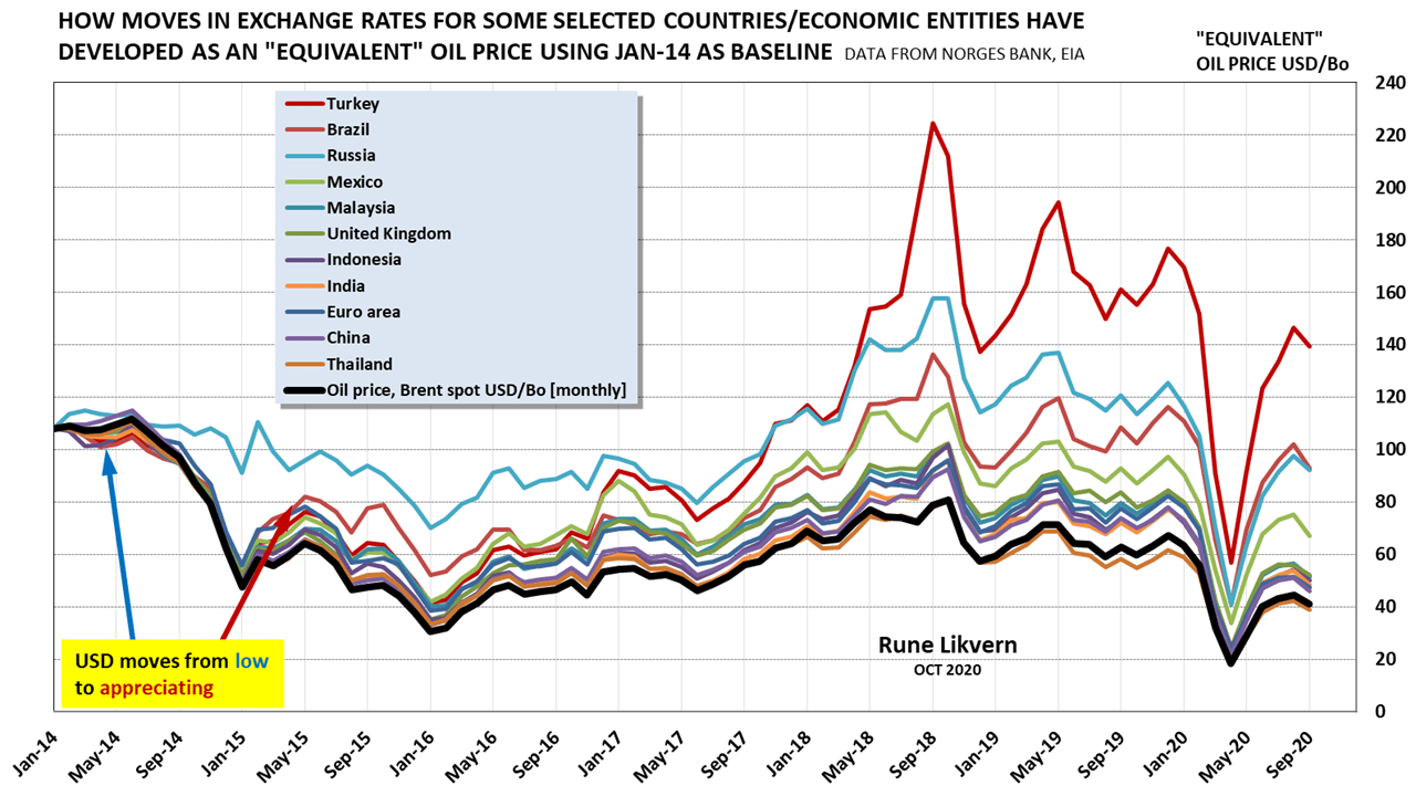
In Jan-14 Brent, (Spot) was at USD 108/Bo, which was about Real 258/Bo in Brazil (“equivalent” oil price of USD 108/Bo).
In Sep-20 Brent, (Spot) was at USD 41/Bo, which was about Real 222/Bo in Brazil (“equivalent” oil price of USD 93/Bo relative to Jan-14).
From Jan-14 and per Sep-20, the price of Brent in nominal USD dropped by 62%, while consumers in Brazil experienced that crude oil (used for its derivatives like gasoline, diesel, kerosene, etc.) priced in Real dropped by only 14%.
The above illustrates how the appreciating USD affects the affordability limit, as expressed in USD, for consumers whose currencies are rapidly depreciating versus the USD.
Of the presented countries, Turkey is in a class of its own.
The term “equivalent” oil price in USD illustrates how (primarily) the strengthening of the USD per Sep-20 translates into the “equivalent” oil price in USD in local currencies using Jan-14 as a baseline.
The chart includes some major oil producers. A stronger USD offset some of the effects from a lower oil price denominated in USD as the oil price in local currencies declined slower due to the appreciating USD. Many of these producers have a significant portion of their operational costs and investments in local currencies.
It now appears as the USD 110/Bo oil consumers in the first half of the previous decade (with a weak USD) could afford has been lowered to about USD 70/Bo primarily due to the appreciating USD.
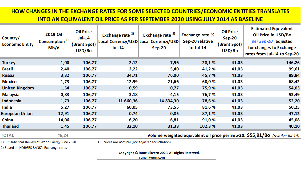
The table also shows how most of the presented countries’ currencies depreciated relative to the USD from Jul-14 and per Sep-20.
Several countries experienced protests in 2019, which also came from a cut in fuel (and food) subsidies resulting in higher fuel prices. In 2019 the average Brent spot oil price was around USD 64/Bo.
Shortly it is expected that the USD will strengthen.
The relationships between DXY, the USD denominated oil price, and supplies have been nonlinear in the recent decade. There is now ample reason to expect that this will continue and become complicated from developments in the consumers’ affordability thresholds for the oil price.
Developments in OECD Petroleum Consumption and Stocks (per Jun-20)
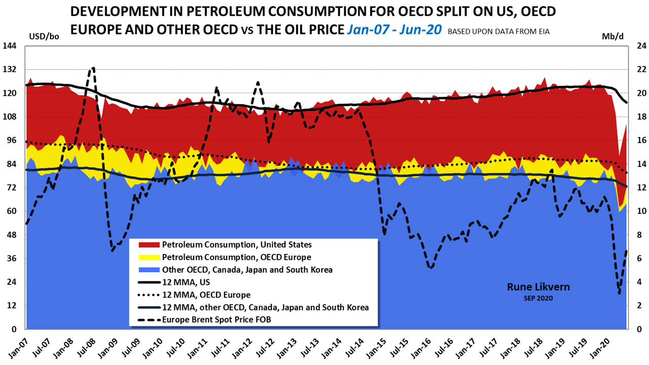
The oil price (Brent spot) is shown against the left-hand y-axis.
OECD annualized (12 MMA) petroleum consumption was down with 0,72 Mb/d (1,5%) [as per Mar-20, and before Covid-19].
The described OECD decline appears to be structural.
An annualized decline as described above does not sound like a lot but held up against projections of YoY growth in consumption of 1%; it starts to add up as for OECD, the difference from one year to another becomes a lowered demand of more than 1 Mb/d.
A decline in consumption in OECD as the oil price is “low” supports the contention that the decline was secular.

Some oil traders and their headline reading algos have, for years, been conditioned to look at changes to the U.S. (and OECD) total petroleum inventory (stocks) levels as a snapshot of the supply-demand balance. This has some merits because, over months, the change in stock levels says something about the supply-demand balance. Rising stock levels signals supplies run ahead of demand and vice versa.
As some trading algos and many analysts stress the importance of movements in OECD crude oil and total petroleum stock levels, primarily driven by the weekly API and EIA numbers for the U.S., I decided to do a statistical analysis.
The statistical analysis for the OECD total petroleum stock levels and the oil price (Brent spot) from Jan-08 to Jun-20 found a correlation of -0,82 and R-squared (lin)of 0,67.
The above shows a strong correlation but a somewhat weaker dependence between the variables. Admittedly weekly figures on the U.S. petroleum stock levels may be a good indicator of the U.S. petroleum market’s status, which now is about 20% of the world market.
How representative is a week over week changes to the U.S. petroleum market and stock levels for the world market and thus for the near future (six to twelve months) price formation for crude oil?
Movements in stock levels are among many indicators and say little about future developments in supply and demand. Stock levels could increase as demand and supplies are on downward trajectories, and demand falls faster than supplies. If stock levels decline over time, demand runs ahead of supplies, but it gives no information about the two’s future trajectories. Complementary information on both supplies and demand/consumption is required to make any sense of weekly changes to U.S. petroleum stocks.
Using weekly changes to U.S. petroleum stock levels for future predictions of the crude oil price becomes a bit like looking into the rearview mirror for the road ahead.
Since the summer of 2011, and primarily due to the rapid growth in US LTO, OECD (C + C) production increased with more than 50% as per Apr-20.
OECD storage as of Jun-20 was at 118 days of forwarding demand (the objective for IEA and its members is for a storage level that covers 90 days of forwarding demand with no adjustments from developments in OECD extraction levels).
Developed petroleum reserves in the ground are a form of storage. The recent increase in extraction levels should perhaps be considered an integral part of the evaluations for the above-ground storage requirements, reducing the significance from weekly changes in U.S. petroleum stock levels on the price formation for oil.
Revisiting a couple of my previous Articles on the Oil Price
In my article “Will growing Costs of new Oil Supplies knock against declining Consumers’ Affordability?” from Oct-16, I floated some thoughts about how declining consumers’ affordability was at odds with the price oil producers’ need to bring new supplies to the market.
“This is where I expect that for some time the oil price will enter the affordability dynamics, as prices starts to move up consumption/demand in response will decline, thus curbing any price growth.”
In my article “The Price of Oil” back in August 2018, I wrote;
“Now and based on what has been presented in this article, I hold it likely that the oil price (Brent) over the coming year [through 2019] and absent any major geopolitical events, will weaken and move in the $55 – $70/Bo range.”
So how did that pan out?

It looked foolhardy back in Aug-18 to predict a span for the oil price of USD 55/Bo – USD 70/Bo based on my interpretations of the global credit impulse, oil supplies, DXY, and other parameters/metrics over the next year. Shortly afterward, the market sent the oil price to USD 85/Bo. As the green band shows, and over time, my prediction did quite well.
For 2019 Brent spot averaged about USD 65/Bo keeping its average within my predicted span.
Covid-19 caused a collapse in the world (C+C) demand and the oil price in the spring of 2020.
Before Covid-19, my expectations were for a lower oil price in 2020, which made me plan for lowering the band in figure 20 with USD 5/Bo – USD 10/Bo relative to 2019. The lowering of the oil price band was based upon my readings of the global credit impulse, oil supplies, and DXY.
So, where is the Oil Price headed for soon?
Since 2015 I have been in the camp that has contended that the oil price (Brent spot) likely could not be sustained above USD 70/Bo for several years bar a noticeable devaluation of the USD or a major geopolitical event curtailing considerable supplies. Covid-19 will likely push the USD 70/Bo milestone out in time.
Few macro and financial indicators support that a sustained higher USD denominated oil price is to be expected.
I am now in the camp that expects a stronger USD. Several of the relief programs to assist struggling consumers due to Covid-19 are being tightened/ended. Any deferred payments on mortgages, rent, auto, and student loans will soon come due (which will grow the demand for USD), suggesting Main Street will have less ability to expand their balance sheets that can accommodate a much higher oil price.
Additionally, U.S. banks recently tightened their lending standards, making it harder for Main Street to access credit.
The Fed’s weekly H.8 tables give close to real-time insight into developments in U.S. private credit (Tables 2 and 3).
Lowering the Fed’s funds rate and low-interest rates (which now is not low enough to create meaningful growth in credit/debt) and more QE are signs of a weak economy struggling with disinflation/deflation. Low-interest rates in the bond market reflect low expectations for economic growth and inflation.
QE is a tool that, with a time lag, brings down the interest rate. QE is not money printing. Some observers/analysts now expect the bond market to start pricing in a higher risk, meaning the bond market could send interest rates higher.
More visible signs of Main Street financial stress is the degree of unemployment (or the low labor participation rate).
Any predictions of the future trajectory of the oil price (in USD) should also incorporate the consequences of the U.S. fiscal and monetary policies that affect the USD’s strength or weakness.
- In light of the USD’s recent years strengthening, it is now hard to find a support that oil price could near term be sustained above USD 70/Bo.
- At some oil price level, local demand destruction sets in. This affordability threshold varies over time amongst the economies.
Again, I found it timely to repeat my former colleague Joules Burns‘ (his pseudonym) apt reformulation to IEA’s Executive summary for IEA WEO 2014.
“…, but turmoil in many key [oil] consuming regions and the difficulties in formulating the right monetary policies mean the world may not be able to respond with adequate [oil] demand.”
Copyright © Rune Likvern 2020. All Rights Reserved.
Written For: Fractional Flow
NOTE
For this article, most of the research and results were completed before measures were put in place to confine the spread of Covid-19 (Coronavirus).
Most readers are likely aware of some, or most of the consequences of the measures to contain the Covid-19 have had and probably will have.
I believe that future developments in world oil supplies, the consumers’ affordability dynamics, the global credit impulse, interest rates, and the U.S. Dollar Index (DXY) will remain essential factors for the future price formation for crude oil.
….
Some assumptions, terms, and acronyms used in the article
BIS, Bank for International Settlements
The 43 reporting countries. In the article, referred to in short as “the 43”.
The time series (from Q4 2002 to Q1 2020) of private and public credit/debt is from Bank for International Settlements (BIS).
The BIS data on private and public credit/debt is for 43 economies that, in recent years, produced about 84% of the world’s Gross Domestic Product (GDP) expressed in PPP (Purchasing Power Parity).
The 43 economies:
Argentina, Australia, BRICS [Brazil, Russia, India, China, and South Africa], Canada, Chile, Colombia, Czech Republic, Denmark Euro area (12 members), Hong Kong SAR, Hungary, Indonesia, Israel, Japan, Korea, Malaysia, Mexico, New Zealand, Norway, Poland, Saudi Arabia, Singapore, Sweden, Switzerland, Thailand, Turkey, United Kingdom, United States.
Note the data does not include credit/debt to financial institutions nor credit debt to “shadow banks,” which, according to some estimates, amounted to USD 52 Trillion at the end of 2017.
Correlation coefficient is a measure of the strength of the straight-line or linear relationship between two variables. The correlation coefficient has values ranging from +1 to -1. The correlation coefficient requires that the underlying relationship between the two variables under consideration is linear.
The correlation coefficient provides a reliable measure of the strength of the linear relationship.
Charts and tables in this article present the correlation coefficient, and the R Squared by some trendlines.
D.M., Developed Markets
DXY, is an index of the value of the USD relative to a basket of some other currencies.
EIA, Energy Information Administration
E.M., Emerging Markets
FRB (the Fed), (U.S.) Federal Reserve Bank
GDP, Gross Domestic Product. The simple formula for GDP is:
GDP = Consumption + Investment + Government Spending + Exports – Imports.
GDP measures the volume of financial transactions within a nation/economic entity for a specified period, usually a calendar year.
GFC, Global Financial Crisis
IEA, International Energy Agency
IMF, International Monetary Fund
LTO, Light Tight Oil
OECD, The Organisation for Economic Co-operation and Development
Oil Price, if not specified otherwise, the oil price referred to is Brent Spot.
Oil Production: In this article, oil production refers to total crude oil and condensate production/extraction.
PPP, Purchasing Power Parity; international dollars
R2 (R Squared) is a statistical measure (the square of the Pearson product-moment correlation coefficient) that represents the variance for a dependent variable explained by an independent variable or variables. R Squared explains to what extent the variance of one variable explains the variance of the second.
The Credit Impulse is a term coined by Michael Biggs, then an economist at Deutsche Bank, when in 2008, he defined it as the change in new credit issued as % of GDP. He showed that, in most countries, private sector demand (C+I) correlates very closely with the credit impulse. He argued that the vital credit variable in forecasting GDP growth is the change in credit flow, not the change in credit stock.
USD or US$; U.S. Dollar
YoY, Year on/over Year
YTD, Year To Date

You must be logged in to post a comment.