Crude oil is the world’s biggest and most important traded commodity.

In some earlier articles, like this and this, I explored for relations between the oil price, the world’s credit creation and interest rates.
This is a continuation of my exploration of how the world’s credit creation affects the structural level of the oil price.
I found it now right to repeat one of my formulations from back in 2015:
- Any forecasts of oil (and gas) demand/supplies and oil price trajectories are NOT very helpful if they do not incorporate forecasts for changes to total world credit/debt, interest rates and developments to consumers’/societies’ affordability.
As time passes more is learned and more data becomes available which in theory should help improve both the understandings and the sights.
This article presents results from applying statistical analysis (with data spanning more than 15 years) for any relations from developments in total credit/debt from the non financial sectors in 43 countries (in 2017 representing more than 90% of the worlds’s GDP) with data from the Bank for International Settlements (BIS) to changes in the oil price, refer also “Some assumptions, terms and acronyms used in the article” at the bottom.
Developments in total credit/debt is very much related to developments in interest rates, primarily the US Federal Reserve Bank’s (FRB) funds rate (as the US dollar is the world’s dominant reserve currency) which now is expected to be set higher, the London Inter Bank Offered Rate (LIBOR) and the US Treasuries 10 Years rate. A keen eye should also be kept on developments on the now flattening yield curve and exchange rate fluctuations.
It is also important to make good assessments about the abilities to the various balance sheets to take on and service more debt. This helps monitor developments in consumers’ affordability which forms the demand side of the equation.
- The structural oil price is formulated from the interactions of fiscal and monetary policies and supply events/policies.
- The oil price has shown and will continue to show wide fluctuations. It is the monetary and fiscal policies that give the dominant structural support for demand and thus the oil price (defines the price movements).
- Suppliers have little control on demand, but could resort to supply policies to support a price floor.
The price collapse in 2014 was a result of strong growth in supplies, primarily led by debt fueled US Light Tight Oil (LTO) extraction. - The strengthening of the US$ (oil is priced in US$) has now resulted in very high oil prices in local currencies, refer also table 1.
- Broadly speaking, it now appears that the world’s non financial sector needs to add $8 – $10 Trillion annually in credit/debt to support growth in the oil price, refer also figure 8.
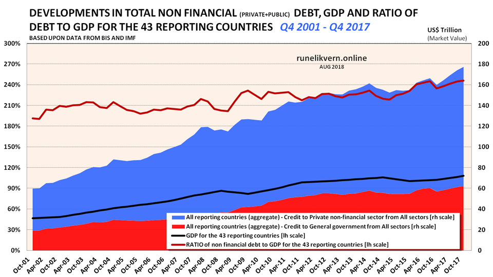
Estimates based on data from the Institute of International Finance (IIF) and BIS show that in Q1 2018 the world’s total non financial debt was $188 Trillion with another $61 Trillion in the financial corporations, totaling $249 Trillion. - Since 2000 there has been 3 distinct credit/debt cycles for the 43 (refer also figure 7 and 8).
The first ended in mid 2008 with the Global Financial Crisis (GFC) (duration about 7 years).
The second ended with the collapse in the oil price in mid 2014 (duration about 5 years).
The third started about mid 2015 and, as of writing, could be entering its fourth year. - The analysis found strongest correlation (above 0,72) between changes to the 43s total private and public credit/debt creation and changes in the oil price at a time lag of 3 months, refer also figure 10.
- Why this matters? If the world’s credit/debt growth supports the oil price, a slowdown or reversal of the world’s credit/debt creation (deleveraging) should be expected to affect the oil (and energy) prices negatively.
The results of the statistical analysis show there is an expected time lag of about 3 months from major changes in the world’s credit creation (leading indicator) to changes in the oil price. The correlations were strong with a time lag of 0 – 6 months from changes in the credit creation to changes in the oil price.
The supply surplus starting in 2014, which collapsed the oil price, appears to be the driver for a period with lower credit creation, which suggest that the lowered oil price temporarily lowered the world’s demand for credit.
- Why this matters? If the world’s credit/debt growth supports the oil price, a slowdown or reversal of the world’s credit/debt creation (deleveraging) should be expected to affect the oil (and energy) prices negatively.
- Changes in credit creation are the strong leading driver of changes in the oil price.
- A simple illustration of the perspectives of the relations of the oil price, interest rate and total debt is now to look at how much the oil price has to grow to have similar effects on the world economy as an increase in the interest rate of 0,25% on the worlds’ total debt of about $250 Trillion, which continues to grow.
An increase of the interest rate of 0,25 % adds $625 Billion to the world’s annual debt service costs. The world now consumes about 30 Gbo/a (crude oil and condensate) which means that an increase in the oil price of $20/bo has about similar effects on the world economy as an interest rate hike of 0,25%. Some major central banks, led by FRB, now plan for more interest hikes and Quantitative Tightening (QT) in the near future. - The above serves as a powerful illustration of the growing competition for how the consumers’ available funds will be prioritized between servicing growing debts or supporting a higher oil price.
Historically, precedence was given to debt service and consumers reduced other (including oil) consumption.
Looking at the hard data there is little that supports the notions from several analysts that the run up to the high oil price in 2008 collapsed the world economy. Note how the annualized average remained above $100/bo (ref figure 1) for a short time in 2008 and compare that to the oil price for the period starting in mid 2011 till late 2014 that did not cripple the world economy. At best the higher oil price in 2008 played a tiny role in what became known as the Global Financial Crisis (GFC). The run up in the oil price towards its apex in 2008 has all the evidence of being the product from a preceding massive credit creation reinforced by speculative momentum identified from a tight demand/supply balance, refer also figure 7.
By looking at figure 8 it becomes clear that what started the GFC was an abrupt reversal in the world’s credit creation starting in early 2008 which developed into something that looks like a freeze up of credit (trust is volatile and can turn in a blink and credit is about trust).
With the steep decline and temporarily deleveraging followed a steep decline in demand/consumption reinforcing the collapse in the oil price which OPEC countered by cutting supplies by about 2,5 Mbo/d in late 2008 to create a new floor for the oil price (note how suppliers cannot control demand).
What allowed the oil price to grow again was a combination of reduced OPEC supplies helped by increased US deficit spending in late 2008, followed by an accelerated credit creation by China in early 2009 (refer also figure 3). The monetary side of the equation was the concerted efforts of the world’s central banks, post the GFC, to bring the world’s economy back on its growth trajectory.
To bring the US economy back on its growth trajectory the US public sector took over through massive growth in deficit spending where the US private sector deleveraged over the next 3 years.
Since 2009 China has been the world’s leader in credit creation.
The growth in credit creation supported growth in oil demand and the oil price and OPEC gradually increased supplies and in early 2011 the oil price again moved north of $100/bo. What followed was a period where the oil price appeared to have found a new high and stable level riding on the back of a worldwide strong credit creation facilitated by central banks low-interest policies.
By mid 2014 the effects of the worldwide massive debt fueled investments in new oil capacities, led by the US LTO industry, brought supplies ahead of demand and collapsed the oil price. The tables now turned, the collapse in the oil price (and other energy prices) led to a (temporarily) decline in the world’s credit creation.
The lasting, low oil price became widely identified as a tug of war between OPEC and the US LTO industry. In early 2017 OPEC+ enacted agreed supply cuts by 1,8 Mob/d to shore up the oil price. This happened less than a year after the Shanghai accord which paved the way for China’s strong releveraging starting in early 2017.
Note in figure 1 how OPEC+ cuts and China’s releveraging in early 2017 joined forces and lifted the oil price $20 – $30/bo.
Gross Domestic Product (GDP)
GDP is a strange animal that needs some attention. Simplistic explained GDP (by some referred to as “income”) measures the volume of monetary transactions within a defined economic entity and normally over a period of one calendar year. Every transaction, being it a service or a product requires the response of some energy. We are conditioned to look upon this transaction in monetary terms, but in reality (like in the physical world) the real currency that realizes the transactions is energy. This is one way to look upon currency/money as a claim on energy.
GDP may be deceptive with regards to the underlying health of the real economy. Some examples of this;
A sale of an existing house from one person to another is accounted as an addition to the GDP, but in the physical world nothing changed, no physical assets (thus no wealth) were added to the economy. An imported car at $50 000 may after tariffs, taxes, markups, etc. be sold for $80 000. The addition to the GDP from this transaction is $30 000 (sales price minus the import price, the service economy at work).
What GDP does not adjust for is to what extent these transactions were financed by credit/debt, that is from borrowing from the future. Increases in credit/debt pull aggregate demand forward.
A popular metric for the indebtedness of an economy is to present the ratio of debts to GDP (in this article I have confined this to the non financial debt to GDP ratio, financial debts have to be added). An economy that has a non financial debt to GDP ratio of 250%, is often and mistakenly perceived as some universal ratio that may be applied to any economy. In other words, this one size fits all does not work in the real world. Further, this may leave the flawed impression that an economy is able to pay off their debts in 2,5 years. No economy works that way.
It is imperative to dig deeper into each economy (or economic entity) to try to get more data on how this debt is distributed among the various sectors. Every economy (country) is unique and has big variations in its debt carrying and servicing abilities which is dependent on its natural resources, educational level of its work force, projections of developments to its demographics, total size of unfunded (pay as you go) promises like pensions, health care and other social services, taxation levels and structures, political and social stability, trends in consumers’ disposable income, if it runs fiscal deficits or surpluses and projections for the developments of these. The mentioned ones are simple descriptions of a few.
The reason why I focus on this is that in some of the charts below are shown both the developments in GDP and the ratio of non financial debt to GDP.
In figure 2 for the 43 reporting countries note how GDP declined after the Global Financial Crisis (GFC) in 2008 and how the ratio of non financial debt to GDP literally jumped. Since then and much thanks to China, exchange rate fluctuations (note the drop in GDP in 2015) it more or less remained constant as parts of the Developed Markets (DM) deleveraged.
The data published by the BIS are a rear mirror view and data for Q1 2018 from the Institute of International Finance (IIF [their global debt monitor], who issued a warning much like IMF) continue to show strong global credit creation of $8 Trillion to a total of $249 Trillion (includes the financial sector).
Many have shown the strong relations between GDP and energy consumption. The less focus has been given to the relations between credit growth, GDP and energy consumption.
The strong relations between credit growth and GDP should have been given much more attention. The role of credit for the sequences in developments in energy consumption and GDP is what is focused on here.
My view has been and is (until proven otherwise) that the relations and normal sequences are;
Changes to credit creation => Changes in energy consumption => Changes in GDP
The relations above are key to understand what structural level can be sustained for the oil price given the present situation with and trajectories for the worlds’ debt levels (status on the balance sheets), announcements about near future (up) trajectories for the interest rates and the declining affordability for a major part of consumers due to the strengthening of the US$.
The big economies, China and US, their credit creation and economic developments pull the developments of others, giving rise to a more or less harmonized development. In 2017, and within this group of 43, the GDP of China and US was around 44%, their credit growth about 40% and their part of growth in GDP from 2016 to 2017 about 39%.
The 43 Economies
Since the end of 2014 to the end of 2017 the 43 added another $22,1 Trillion (about 14%) in non financial debt, which produced a nominal GDP growth of $1,5 Trillion (from $70,6 Trillion to $72,1 Trillion or about 2,1%) and the prospects of higher interest rates together with the rapid growth in the oil price and the strengthening US$ are expected to produce noticeable headwinds for world economic growth. Numbers are nominal and US$ market value.
The above and keeping in mind the prospects of higher interest rates begs the question what part of future growth in credit/debt creation will become allocated towards the growth in debt service?
China

There are several noticeable takeaways from figure 3, and below are some:
- The acceleration of China’s debt creation starting in 2009.
- The slow down in both debt creation and GDP [black line, rh axis] around the Shanghai accord in early 2016.
- The strong releveraging starting in early 2017.
- Note the development in the ratio of non financial debt to GDP [red line, lh axis].
The US
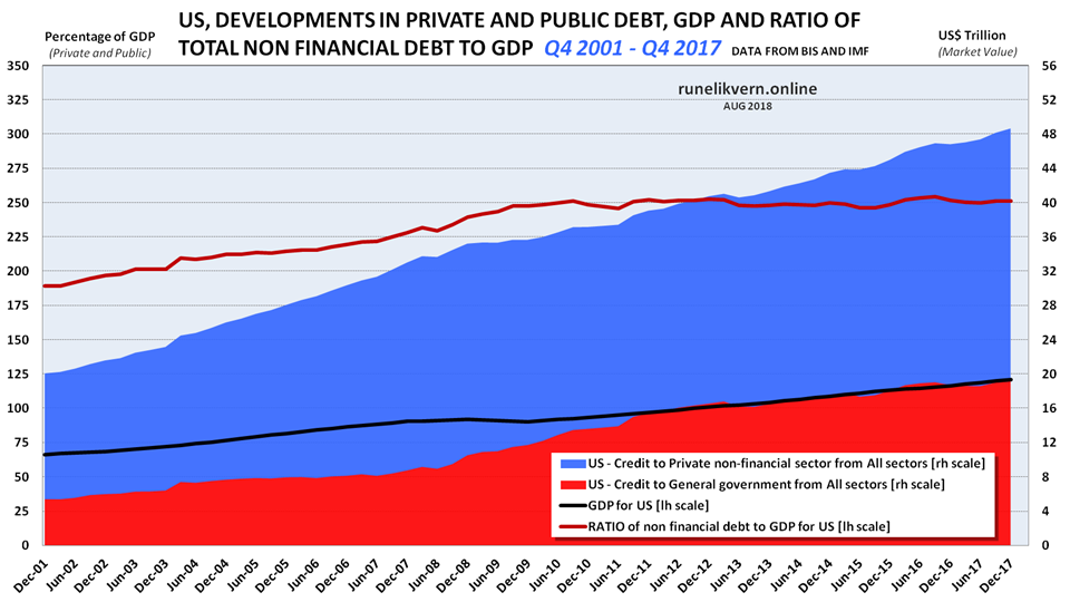
There are several noticeable takeaways from figure 4, and below are some:
- The rapid growth in the US deficit spending since 2008 to offset the deleveraging in the private sector.
- How the rapid growth in US deficit spending with some time lag brought US GDP [black line, rh axis] back on its growth trajectory.
- Note that the development in the ratio of the US non financial debt to GDP [red line, lh axis] ratio has stayed at around 250% since late 2009. That very much looks like debt saturation. Higher interest rates will reduce the debt carrying and servicing abilities.

Chart from Federal Reserve Bank of New York.
The FRB’s funds rate is one of the world’s most important interest rates. As of early 2009 the FRB cuts kept the effective funds rate under 0,25% and note how this coincided with an US non financial debt to GDP ratio of around 250% (refer also figure 4).
The recent increases in the federal reserve funds rate as of late 2016 takes its time to work through the food chain, but a higher interest rate should be expected to result in tighter balance sheets. If so, one outcome from further increases in the FRB’s funds rates is likely to be lowered ratio of non financial debts to GDP, this will also be recognized as deleveraging (bankruptcy is one way to deleverage).
Throw into the equation the scheduled unwinding of the FRB’s balance sheet, also known as Quantitative Tightening (QT).

The chart illustrates that until the GFC in 2008 it was primarily the US that pulled the world economy by its credit growth. This together with a tight oil supply/demand balance helped fuel the nominal high in the oil price in 2008 (refer also figure 1). The GFC was actually a collapse in US credit growth, which China alleviated by accelerating it’s from 2009.
Since 2009 it has been China that provided the major part of the 43’s credit/debt growth.
Affordability
In this post from October 2016 I floated some thoughts about how declining consumers’ affordability was at odds with the oil producers’ need for higher oil prices to bring new supplies to the market.
“This is where I expect that for some time the oil price will enter the affordability dynamics, as prices starts to move up consumption/demand in response will decline thus curbing any price growth.”
A recent OECD study on wage stagnation is supportive of this affordability dynamic.
“Wage growth remains remarkably more sluggish than before the financial crisis. At the end of 2017, nominal wage growth in the OECD area was only half of what it was ten years earlier: in Q2 2007, when the average of unemployment rates of OECD countries was about the same as now, the average nominal wage growth was 5.8% vs 3.2% in Q4 2017.”
Stagnating and even lowered wages expressed in US$ for most consumers together with diminishing access to credit/debt due to growing interest rates and QT begs the question how most consumers can afford higher priced oil (and energy)?
One way to tackle this is by reducing consumption.
Changes in demographics (core population aged 15 – 60) is also a reason to consider and may play a part in the 15% lowered petroleum consumption from 2012 to 2017 in Japan.
The Oil Price and Exchange Rates

For the economies presented in table 1 it was estimated that these had a volume weighted equivalent oil price of about $94/bo per Jul-18 relative to Jan-14. This is caused by the strengthening US$. Several countries, like Brazil and India, experienced earlier this year protests against higher fuel prices as the oil price moved and remained above US$70/bo.
As of writing the oil price has come down a bit while it is expected that the US$ will continue to strengthen due to US fiscal and monetary policies.
Lasting high oil prices lowers consumption/demand and has the potential to weaken the oil price.
- It now appears as the US$110/bo oil from the middle of this decade has been lowered to about US$70/bo.
The Oil Price and Credit/Debt
What follows are the analysis of the relations of YoY changes in the oil price versus changes in the 43’s credit creation.
Numbers have not been adjusted for volumes (changes in consumption).

Figure 7 may seem poorly harmonized as it shows the oil price versus YoY changes in credit/debt for the 43. Despite this it intuitively shapes a story about relations between credit creation and the oil price. Note how the run up in the oil price towards its apex in the summer of 2008 follow (lags) the rapid growth in credit. The collapse in credit growth preceded the collapse in the oil price in the summer of 2008 (the world operates on credit).
The growth in the oil price from 2009 was mainly made possible through a combination of OPEC cuts in supplies and China’s acceleration of its credit creation. Since then a stable, high credit creation allowed for tolerances of a lasting, high oil price (US$110/bo) and growth in oil consumption.
The collapse in the oil price in 2014 preceded the collapse in credit creation. It was OPEC+ cuts in supplies (effective Jan-17) and renewed growth in credit creation (China’s releveraging) that fueled the recent growth in the oil price.
Figure 7 describes 3 distinct credit/debt cycles; the first lasting until mid 2008 (duration about 7 years), the second ended with the collapse in the oil price in 2014 (duration about 5 years) and the third was per Q1 2018 in its third year (in its fourth year as of writing and per Q3 2018).
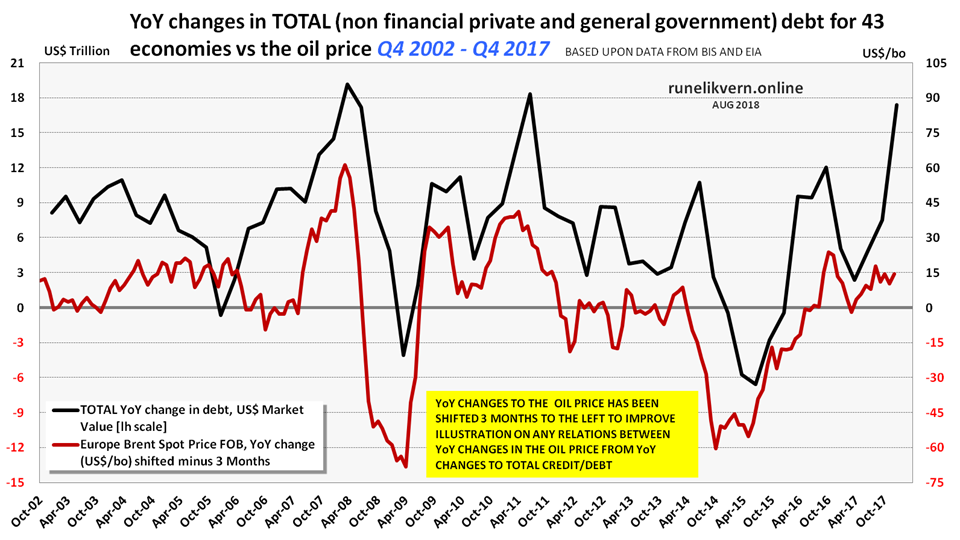
The chart leaves an impression that normally the oil price follows changes to the 43’s credit creation by about 3 months.
The black dotted line shows the trajectory during the oil price collapse of 2008 and the red dotted line the trajectory during the oil price collapse of 2014.
The shown combination resulted in the highest correlation from the statistical analysis and is the reason it is presented.
The scatter chart shows that oil price increases are very much related to growth in credit/debt (collection of dots in the upper right quarter) and vice versa when changes to credit/debt growth slows/goes negative, the oil price follows.
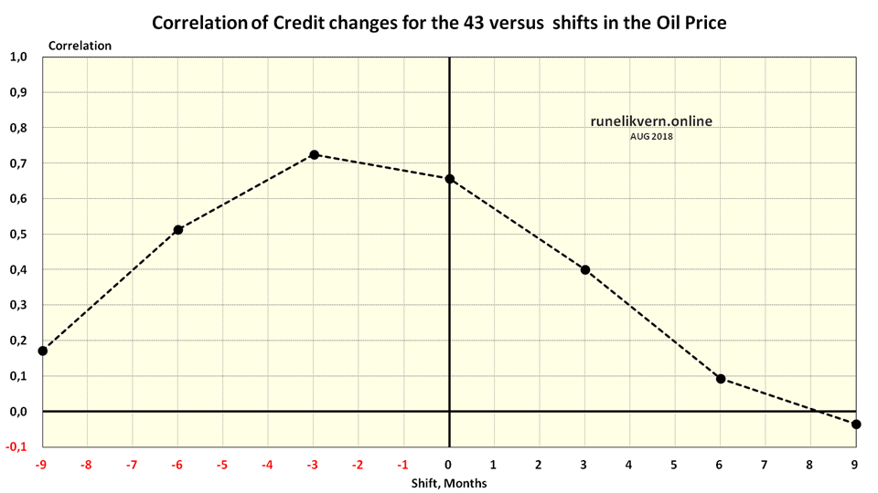
The analysis found strongest correlation (above 0,72, which is strong) between changes to the 43s total private and public credit/debt creation and changes in the oil price at a time lag of 3 months. A longer time lag weakened the correlation and the strong correlation found with no time lag is believed to be a result of the oil price collapse of 2014.
The time series used are quarterly and spans Q4 2002 to Q4 2017 (15 years).
The oil price collapse of 2014 has likely lowered the correlation and skewed the results from the analysis somewhat to the right. The correlations got stronger with a longer time series.
So why does this matter? If credit/debt growth is a leading indicator that generally supports growth in or sustains a high level for the oil price, a slowdown or reversal of credit/debt creation should be expected to affect the oil (and energy) prices negatively. The analysis is based on US$ market value in debt/credit creation and is subject to fluctuations in the exchange rates.
Caution should be exercised from interpreting the results of this statistical analysis as absolutes.
Generally the results of the statistical analysis suggest there appears to be a time lag of about 3 months from changes in the world’s total credit creation (expressed in US$ market value) to changes in the oil price.
So where is the Price of Oil headed?
Good predictions on the demand/supply balance for oil are certainly helpful, but I will keep up that demand may be the measure that now is most difficult to predict without good feedback loops from monetary and fiscal policies.
Demand has been, is and will continue to be what can be paid for.
To me the conditions for a sustained higher oil price appears weakened due to more stressed balance sheets, perceptible stresses to consumers’ affordability and the notifications from the world’s dominant central banks about future raises to the interest rate and the continued unwinding of their balance sheets.
Oil prices could enter a (temporarily) bull run by money withdrawn from the stock/bond markets and placed on bets in commodities in the search for yield.
Now, and based on what has been presented in this article, I hold it likely that the oil price (Brent) over the coming year and absent any major geopolitical events, will weaken and move in the $55 – $70/bo range.
I now hold it conceivable that some event(s) in the financial system and its multitude of derivatives will impact the oil price far more than predictions based on the oil demand/supply balance.
Such event(s) is hard to find before after the facts.
I now hold it very likely that the strategies implemented following some emergency board meeting in one of the world’s biggest and highly leveraged financial institutions sets of something likened to the snowflake that sets off the D5 avalanche; financial contagion start slowly at first and then end by destroying many things in its path.
The video clip below is from the movie “Margin Call” (2011) and serves to illustrate such a board meeting in a fictitious investment bank, known only as NBS, with Jeremy Irons brilliantly portraying John Tuld, the CEO and Chairman of the Board.
This time I found it right to repeat my former colleague Joules Burns’ (his pseudonym) apt reformulation to IEA’s Executive summary for IEA WEO 2014;
” …, but turmoil in many key [oil] consuming regions and the difficulties in formulating the right monetary policies mean the world may not be able to respond with adequate [oil] demand.”
Copyright © Rune Likvern 2018. All Rights Reserved.
Written For: Fractional Flow.
Some assumptions, terms and acronyms used in the article
BIS, Bank for International Settlements
The 43 reporting countries. In the article these are in short referred to as “the 43”.
The time series (as from Q4 2002 to Q4 2017) of private and public credit/debt are from Bank for International Settlements (BIS).
The BIS data on private and public credit/debt are for 43 economies that in recent years produced over 90% of the world’s Gross Domestic Product (GDP) expressed in US$ and market value.
The economies:
Argentina, Australia, BRICS [Brazil, Russia, India, China and South Africa], Canada, Chile, Colombia, Czech Republic, Denmark Euro area (12 members), Hong Kong SAR, Hungary, Indonesia, Israel, Japan, Korea, Malaysia, Mexico, New Zealand, Norway, Poland, Saudi Arabia, Singapore, Sweden, Switzerland, Thailand, Turkey, United Kingdom, United States.
Not adjusted for volumes (changes in consumption).
DM, Developed Markets
EM, Emerging Markets
FRB, (US) Federal Reserve Bank
GDP, Gross Domestic Product. The simple formula for GDP is:
GDP = Consumption + Investment + Government Spending + Exports – Imports.
GDP measures the volume of financial transactions within a nation for a specified period, normally a calendar year.
GFC, Global Financial Crisis
IEA, International Energy Agency
IIF, Institute of International Finance
IMF, International Monetary Fund
LIBOR, London Inter Bank Offered Rate
LTO, Light Tight Oil
Oil Price, if not stated otherwise the oil price refers to Brent.
The Euro zone; Austria, Belgium, Cyprus, Estonia, Finland, France, Germany, Greece, Ireland, Italy, Latvia, Lithuania, Luxembourg, Malta, the Netherlands, Portugal, Slovakia, Slovenia, and Spain.
WEO, World Energy Outlook (Annual report by IEA)
QT, Quantitative Tightening is a monetary policy applied by a central bank to decrease amount of liquidity within the economy. This is the opposite of Quantitative Easing.

One thought on “The Price of Oil”
Comments are closed.