NORWAY’s PETROLEUM ECONOMY STRUGGLES WITH DECLINING DEBT PRODUCTIVITY

In this post I present a closer look into the developments in the Norwegian Gross Domestic Product (GDP) and the Marginal Productivity of Debt (MPD) from households, non-Financials and municipalities.

Further a brief update on developments in credit/debt growth (for households, non-Financials and municipalities) in Norway. Sovereign debt and debts in the financial sector are not included in this analysis and for a complete analysis ALL DEBTS have to be included. Norway is a small and open economy that is exposed to developments in the global economy (like the price of oil) and its trade relations.

This post is an expansion to my previous post A closer Look into the Drivers of the Norwegian Economy’s recent Growth Success with some updates.

The post also presents a brief look at how recent years developments in the oil price and total petroleum extraction and sales have affected Norwegian GDP, credit/debt growth, the MPD and petroleum related expenditures and what this may portend for the near future.

NOTE: All financial data in this post are in the Giga Norwegian krone (GNOK; Billion NOK) unless otherwise specified. 6 NOK approximates now around 1 US dollar.
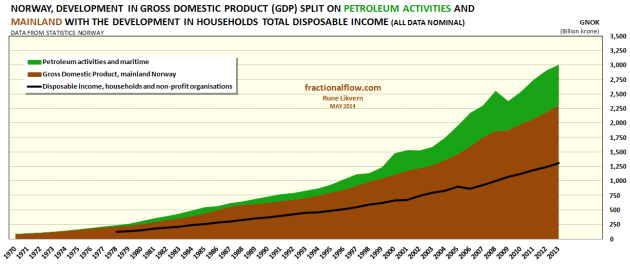
Figure 1: Chart above shows the development in the Norwegian Gross Domestic Product (GDP) split on mainland Norway (brown area) and petroleum and maritime activities (green area). The Norwegian petroleum activities are offshore within the Norwegian maritime economic zone. At present exchange rates Norway’s GDP for 2013 was around $500 Billion (nominal). The black line shows the development for total nominal disposable income for Norwegian households.
Figure 1: Chart above shows the development in the Norwegian Gross Domestic Product (GDP) split on mainland Norway (brown area) and petroleum and maritime activities (green area). The Norwegian petroleum activities are offshore within the Norwegian maritime economic zone. At present exchange rates Norway’s GDP for 2013 was around $500 Billion (nominal).
The black line shows the development for total nominal disposable income for Norwegian households.

The chart illustrates how the Norwegian GDP has been on a steady growth trajectory during the recent four decades and how petroleum activities, which started in the late 1960’s,  gained in relative importance of GDP developments. The effects of growth in the petroleum activities are documented to spill over into the mainland GDP.
In 2013 around 23% of Norway’s GDP was from petroleum related activities.

The acceleration in the Norwegian GDP from around 2004 have been identified to come from two main sources;

  1. The growth in the oil price that really took off from around 2004 spilled over to the mainland economy.
  2. The credit/debt growth from households, non-Financials and municipalities.
    This was likely triggered by the growth in the oil price as it revived consumers’ perception of improved outlooks to service more debt as disposable income grew and interest rates started to decline (cheap credit), which again was reinforced from the feedback from rising housing prices and growth in stock indices (equity growth).

As Norwegian petroleum extraction is in general decline and its gross revenues subject to oil price developments, the remaining force to sustain Norwegian GDP growth is to entice the households for continued growth in debt financed consumption.

Continue reading “NORWAY’s PETROLEUM ECONOMY STRUGGLES WITH DECLINING DEBT PRODUCTIVITY”

CENTRAL BANKS’ BALANCE SHEETS, INTEREST RATES AND THE OIL PRICE

In this post I present a more detailed look at developments in central banks’ balance sheets, interest rates and the oil price since mid 2006 and as of recently.

Paper and digital money are human inventions. Most people truly believe it is money that powers the society and their lives because they have never had reason to think otherwise. Money does not create energy, but it allows for faster extraction from stocks of energy (like fossil fuels) and influences consumers’ affordability of energy.

It is humans’ ability to use external energy that gives humans leverage over other animals. The financial system in general does not recognize oil for what it is, it treats it like another commodity.
We (the aggregate human hive) moved to use more financial debts as a way of pulling resources for consumption (like oil) forward in time when Limits To Growth (LTG) was written. In recent years global credit/debt creation went exponential. The workings of financial debts (created “ex nihilo”) was not included in LTG and the effects of debts are rarely recognized when Gross Domestic Product (GDP) is estimated and its future trajectory projected.

This post takes a closer look at the question:
•   “Could the cumulative effects of the strong growth in oil prices starting back in 2004, which signaled a tighter oil supply/demand balance, upon working their way through the economies, have contributed to forcing the central banks’ to deploy their tools of lower interest rates and growing their balance sheets – measures which have mitigated some of the effects of higher priced oil?”
It is recommended to read this post as an extension to my post “Global Credit growth, Interest Rate and Oil Price – are these related?” where I showed that apparently something fundamentally changed in previous mid decade.

Data from the big western central banks, US Federal Reserve (Fed), European Central Bank (ECB), Bank of England (BoE) and Bank of Japan (BoJ) have been lifted from the article “Chart Of The Day: The Fed (And Friends) $10 Trillion Visible Hand” which recently was published by Tyler Durden at ZeroHedge.

Figure 1: The chart above is a composite of two charts. The bottom chart shows the developments for the total central banks’ assets on the balance sheets and the interest rate for Federal Reserve [Fed], European Central Bank [ECB], Bank of England [BoE] and Bank of Japan [BoJ]. Developments in total central banks’ assets in US$ Trillion are shown by the green line and plotted versus the outer right hand scale.  Developments in the interest rate (%) are shown by the dark blue line line and plotted versus the inner right hand scale.  On top of the chart and with synchronized time axes is overlaid the development in the oil price (US$/Bbl, Brent spot), red line and plotted versus the left hand scale.
Figure 1: The chart above is a composite of two charts. The bottom chart shows the developments for the total central banks’ assets on the balance sheets and the interest rate for Federal Reserve [Fed], European Central Bank [ECB], Bank of England [BoE] and Bank of Japan [BoJ].
Developments in total central banks’ assets in US$ Trillion are shown by the green line and plotted versus the outer right hand scale.
Developments in the interest rate (%) are shown by the dark blue line line and plotted versus the inner right hand scale.
On top of the chart and with synchronized time axis is overlaid the development in the oil price (US$/Bbl, Brent spot), red line and plotted versus the left hand scale.
Since the start of the global financial crisis (GFC) in 2008 the western central banks (Fed, ECB, BoE and BoJ) have grown their total assets above $10 Trillion and added around $7 Trillion to their balance sheets in the last 7 years.

The overlay with the developments in the oil price on the chart with central banks’ (CBs) balance sheets and interest rate (ref also figure 1), creates the impression that massive CBs liquidity injections and considerable cuts to the interest rate renewed the support for the oil price after it collapsed from its high in the summer of 2008.

The oil price has remained fairly stable since 2011 (around US$110/Bbl) as the western central banks continued to expand their balance sheets at an annual average rate of around US$1 Trillion and kept interest rates low. Then add the expansive credit/debt creation of other big economies, like Brazil and China, during this same period.

Continue reading “CENTRAL BANKS’ BALANCE SHEETS, INTEREST RATES AND THE OIL PRICE”

GLOBAL CREDIT GROWTH, INTEREST RATE AND OIL PRICE – ARE THESE RELATED?

For some years my general understanding has been that the price formation for most commercial traded materials/products/items (including oil, which is paramount for all economic activities) is very much related to credit/debt growth, total debt levels and the interest rate (the price of money which also is a measure of credit risk).

In an effort to continue economic growth (to save the system and avoid the mother of all deflations) the worlds leading central banks (US Federal Reserve [FED], the most important one as the US dollar also serves as the world’s reserve currency, Bank of England [BoE] and will the European Central Bank [ECB] soon follow?) in recent years resorted to quantitive easing (QE) and lowered interest rates to almost zero to ease the burden from growing total debt loads. QE was intended to be a temporary measure.

The central banks (CB) actions appear to be a lot about preserving wealth ({inflating} assets) while there is little they can do about nature’s CAPITAL, like energy stocks (most importantly fossil fuels).

The CBs likely pursued these measures as they had few other good alternatives. It appears that the CBs policies may also have influenced the oil markets and helped shape the oil companies’ strategies to deal with a tighter supply/demand balance since 2005 by encouraging them to take on more debt and go after the more “expensive” oil.

The world has also become more complex, interconnected and continued good growth in its Gross Domestic Product (GDP) post the global financial crisis.

CBs do not have the capabilities to create cheap, abundant and lasting energy supplies. For some limited time the world’s CBs and their policies may have alleviated (and for some time continue to) some of the effects of the growth in oil/energy prices, though this was likely not their primary objective when they deployed their policies.

WHAT SUPPORTED GROWTH IN OIL DEMAND AND PRICE FORMATION?

Econ 101 refers to the law of supply and demand as the price arbitrator for raw materials, goods and services. The credit/debt will be assumed and mortgaged against promises to honor it in the future and pay interest.

One understanding of our economies is to view them as thermodynamic flows where money is the facilitator that brings energy/thermodynamic flows to and allocate these within the economies.

During the recent decades, growth in credit/debt (borrowing from the future) grew aggregate demand and to some extent negated the price growth induced from demand growth.

The recent years continued growth in credit/debt was stimulated by lowering the interest rate. By keeping interest rates low, less revenues/funds were needed to service the consequences of the growth in total debts, and thus allowed for continued deficit spending and thus support economic activities at elevated levels.

In March 2014 the Bank for International Settlements (BIS in Basel, Switzerland) published a paper titled Global liquidity: where it stands, and why it matters (pdf file, 200 kB) which presented some interesting data and observations about developments in global bank credit/debt levels.

Figure 01: The 6 panel graphic above shows global bank credit aggregates and the most important borrower regions. The chart at upper left shows that global bank credit more than doubled from 2000 to 2013. In the US [upper middle chart] the growth in bank credit slowed from around 2007 (the subprime/housing crisis) and overall credit growth was continued by increased public borrowing for deficit spending. In the Euro area [upper right chart] the total debt levels led to a slowdown in growth of bank credit post 2008 (or the Global Financial Crisis; GFC) and more recently it appears as deleveraging has started [default is one mechanism of deleveraging]. In the Euro area petroleum consumption is now  down around 13% since 2008. Asia Pacific [lower left chart] which includes China, continued a strong credit growth and thus carried on the global credit growth. Latin America [lower middle chart] which includes Brazil, continued together with Asia Pacific the strong total global credit growth. Global GDP in 2013 was estimated at above $70 trillion.
Figure 01: The 6 panel graphic above shows global bank credit aggregates and the most important borrower regions. The chart at upper left shows that global bank credit more than doubled from 2000 to 2013.
In the US [upper middle chart] the growth in bank credit slowed from around 2007 (the subprime/housing crisis) and overall credit growth was continued by increased public borrowing for deficit spending.
In the Euro area [upper right chart] the total debt levels led to a slowdown in growth of bank credit post 2008 (or the Global Financial Crisis; GFC) and more recently it appears as deleveraging has started [default is one mechanism of deleveraging]. In the Euro area petroleum consumption is now down around 13% since 2008.
Asia Pacific [lower left chart] which includes China, continued a strong credit growth and thus carried on the global credit growth.
Latin America [lower middle chart] which includes Brazil, continued together with Asia Pacific the strong total global credit growth.
Global GDP in 2013 was estimated at above $70 trillion.
Private and public debt growth through the recent decades added support for the increased oil consumption and negated the effects of higher prices caused by a tight supply/demand balance. In recent years the consumers (private sector) in many Western countries are at what appears as debt saturation, and several sovereigns are trying to carry on the overall debt growth through increased  public borrowing and deficit spending, albeit at lower levels.

Continue reading “GLOBAL CREDIT GROWTH, INTEREST RATE AND OIL PRICE – ARE THESE RELATED?”